Create fancy card with animated gradient border
In this tutorial, I’ll walk you through creating an animated gradient border effect using CSS custom properties, which can add a dynamic and eye-catching look to your UI components. By the end, you’ll have a simple card with an animated gradient border, using css custom @property.
If you are are not familiar with css custom @property read this blog first.
Basic card structure
We will be using react for this tutorial, the basic card will look like this
import "./styles.css";

const CardAnimatedBorder = () => {
  return (
    <div className="container">
      <div className="card">This is a card with animated gradient border</div>
    </div>
  );
};

export default CardAnimatedBorder;
Adding basic styles to the card
.container {
  width: 100%;
  height: 200px;
  display: flex;
  align-items: center;
  justify-content: center;
}

.card {
  margin: 0 auto;
  padding: 2em;
  width: 300px;
  background: #1c1f2b;
  text-align: center;
  border-radius: 10px;
  color: #ffffff;
  position: relative;
}
Creating a simple border
Before creating a gradient animated border let’s see how to create a simple border. We will not use the css border property but instead use pseudo elements ::before and ::after for the card. Another important property here is inset which allows us to place the pseudo elements inside the card. The z-index will be -1 as we want the border to be below the card content.
.card::after,
.card::before {
  content: "";
  position: absolute;
  background: red;
  inset: -4px;
  z-index: -1;
  border-radius: 10px;
}
Our card now looks like this
Adding custom property --angle
We will add a custom property to track the angle of the gradient. We will be using conic-gradient.
Add a custom property like this
@property --angle {
  syntax: "<angle>";
  initial-value: 0deg;
  inherits: false;
}
and make the following changes to the css
- Replace
backgroundwithbackground-imageto display gradient. - Add an animation
spinfor the custom propertyangle. - The
conic-gradienthas angle as first argument and we will be changing it in order to animate. - Add
blurandopacityfor a glowing effect.
Your css should look like this
.container {
  width: 100%;
  height: 200px;
  display: flex;
  align-items: center;
  justify-content: center;
}
.card {
  margin: 0 auto;
  padding: 2em;
  width: 300px;
  background: #1c1f2b;
  text-align: center;
  border-radius: 10px;
  color: #ffffff;
  position: relative;
}

@property --angle {
  syntax: "<angle>";
  initial-value: 0deg;
  inherits: false;
}
.card::after,
.card::before {
  content: "";
  position: absolute;
  background-image: conic-gradient(
    from var(--angle),
    transparent 70%,
    blue,
    red
  );
  inset: -4px;
  z-index: -1;
  border-radius: 10px;
  animation: 2s spin linear infinite;
}

.card::before {
  filter: blur(1rem);
  opacity: 0.7;
}

@keyframes spin {
  from {
    --angle: 0deg;
  }
  to {
    --angle: 360deg;
  }
}
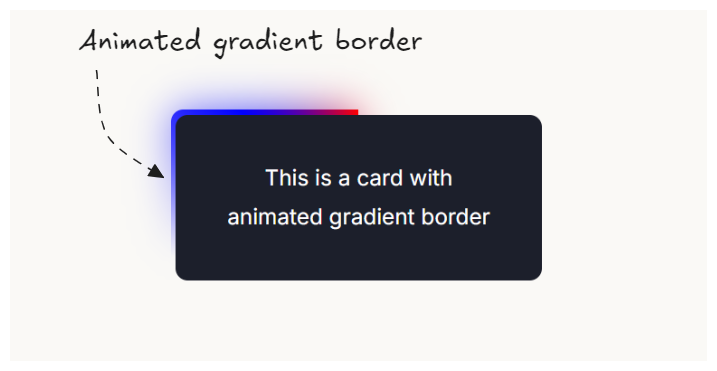
And finally we have a card with animated gradient border.